
")
Introduction
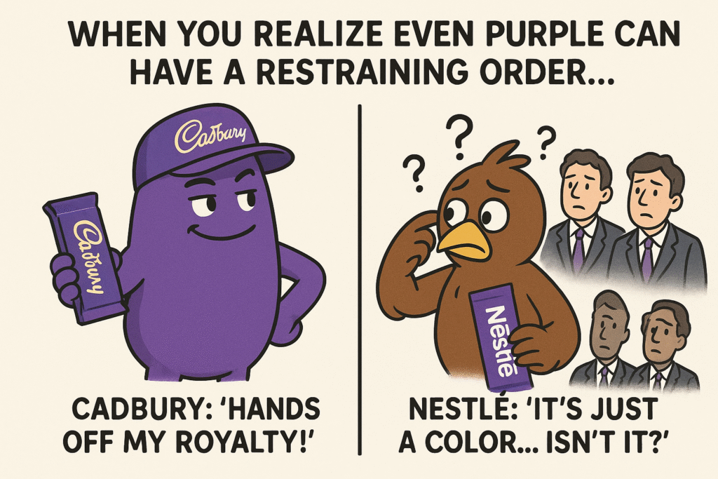
Purple isn’t just a color; it’s the heartbeat of Cadbury’s chocolate legacy. The moment you see that rich shade (Pantone 2685C), you know it’s Cadbury. It’s more than packaging; it’s a promise of indulgence, a mark of trust, and a taste of tradition loved by millions. But what happens when a color becomes so iconic that it’s worth fighting for?
That’s exactly what unfolded when Cadbury set out to claim exclusive rights to its purple packaging and Nestlé stepped in to challenge it. This wasn’t just a rivalry between two chocolate giants; it became one of the most talked-about trademark battles in recent history. Courts, brands, and experts were left asking: Can a color alone, without any logo or words, be protected as a trademark? How precise does the description need to be? And where’s the line between guarding a brand and keeping the market fair?
The Cadbury vs. Nestlé story is more than legal jargon; it’s a gripping tale of how creativity, commerce, and competition collide, with lessons that every brand owner, strategist, or curious shopper can learn from.
Background of the case
Cadbury’s purple isn’t just about looks; it’s a story of heritage, royalty, and brand identity that goes back more than a century. The iconic shade, Pantone 2685C, wasn’t chosen by chance. In 1914, Cadbury introduced this royal purple as a tribute to Queen Victoria, who loved the color. Even earlier, in 1854, Cadbury had earned a Royal Warrant, becoming the official chocolate supplier to the British monarchy. This royal connection gave the brand’s purple packaging an unmatched sense of tradition and elegance.
Over the years, purple became inseparable from Cadbury’s identity. Combined with gold accents, it created a signature look for Dairy Milk chocolate bars, one that consumers instantly recognized as a mark of trust, quality, and indulgence.
Knowing how powerful this color was for its brand, Cadbury made a bold move in 1995, registering the purple as a trademark for chocolate bars and tablets. The aim? To protect its identity and stop others from copying its signature look.
But where there’s a strong brand, competition isn’t far behind. Enter Nestlé, Cadbury’s longtime rival. Nestlé challenged the trademark, arguing that Cadbury’s description was too vague, especially the term “predominant,” which, they claimed, could unfairly block other brands from using similar purples or packaging designs.
What followed was a gripping legal battle full of twists, appeals, and courtroom drama that lasted for years. This wasn’t just about one color; it raised bigger questions: Can a color alone be trademarked? How clearly must it be defined? And how do we balance protecting creativity with keeping competition fair?
The Cadbury vs. Nestlé saga not only tested the limits of trademark law but also set new rules for how colors are treated in branding. It’s a story about innovation, identity, and the delicate balance between standing out and letting others play the game.
The Legal Puzzle: Can a Color Alone Be a Trademark?
At first glance, it might seem odd to think a color by itself could be a trademark. After all, colors are everywhere! But in the world of branding, some colors are so closely tied to a product that they become instantly recognizable, and that’s where the law steps in.
Under trademark law, colors can be protected, but only if they meet some strict rules. According to Section 1(1) of the UK Trademarks Act 1994 and Article 2 of the EU Trademark Directive, a trademark isn’t just about logos or words; it can also be a “sign” that clearly identifies a brand. So, if a color is used in such a way that consumers immediately link it to one company’s product, it might qualify for trademark protection.
But there’s a catch.
Color can’t just be decorative or functional; it must have distinctiveness. In other words, it must be something that shoppers see and instantly think, “That’s from this brand!” Think of Cadbury’s purple or Tiffany’s blue colors that are more than aesthetics; they’re brand ambassadors.
The real challenge- A color on its own, without any logo, words, or shape, must be defined clearly. Imagine trying to explain exactly which purple you mean! A slight variation in shade, texture, or placement could make a big difference. That’s why trademark law demands that the color be described in a way that leaves no room for confusion. If it’s too vague, it could unfairly block other businesses from using similar colors, even if they’re doing so in a completely different way.
This requirement ensures that trademarks don’t give companies an unfair monopoly over something as common as a color. It’s a delicate balancing act protecting brand identity without shutting out healthy competition.
This is where the Cadbury case becomes so fascinating. It’s not just about one company trying to own purple; it’s a legal puzzle about how far trademark rights should go and how clearly a color must be defined for protection. It’s the kind of case that reshapes the rules, one shade at a time.
The Key Legal Arguments: Purple vs. Precision
Cadbury’s argument was simple but powerful: its signature purple (Pantone 2685C), proudly displayed on Dairy Milk chocolate packaging for decades, had become so closely tied to the brand that it deserved full trademark protection. To consumers, that shade of purple wasn’t just decoration; it was an instant signal of Cadbury’s chocolate.
But Nestlé saw things differently. Relying on Section 3(1)(a) of the Trade Marks Act 1994, Nestlé argued that Cadbury’s claim was too vague, especially because it described the trademark as the “predominant color.” According to Nestlé, that wording was a loophole wide enough to cover countless shades and packaging designs, giving Cadbury unfair control over a broad spectrum of purples. Trademark law, they insisted, required precision. A trademark couldn’t be so ambiguous that it blocked others from using similar colors fairly.
The heart of the dispute was this: for a color to be protected, it must be clearly defined and capable of identifying a brand without confusion. Without specificity, a trademark claim could become a monopoly.
Courtroom Drama and Rulings
The battle over Cadbury’s purple trademark played out like a courtroom drama filled with high stakes, sharp arguments, and deep questions about how far intellectual property law could go in protecting brand identity. The case began when Cadbury, confident that its rich purple color defined its brand, sought exclusive rights to it. But in 2013, the courtroom scene shifted dramatically when the UK Court of Appeal delivered a setback. The judges questioned whether the description of the mark “predominantly purple” was too ambiguous. They ruled that such wording left too much room for interpretation, potentially allowing endless variations of purple to be registered, creating confusion and harming fair competition. This decision underscored the strict requirements of Article 2 of the Trademarks Directive, which demands that a trademark be clearly defined and graphically represented to ensure certainty and fairness.
The courtroom tension escalated as Cadbury regrouped and sharpened its approach. Armed with a new application, the company specified the exact shade Pantone 2685C and precisely described where and how the color would be applied to packaging. The renewed application raised fresh debates. Could a color, devoid of logos or words, truly serve as a trademark? Opponents argued that allowing such claims would grant excessive control over commonly used elements. Yet Cadbury pressed on, presenting evidence of years of consumer association with purple packaging.
The final act came in 2022 when the UK High Court delivered a landmark judgment. The court acknowledged that a color alone, if clearly defined and shown to have acquired distinctiveness in the marketplace, could be granted trademark protection. Cadbury’s extensive market use and consumer recognition tipped the scales, proving that the color was no mere aesthetic choice but a vital identifier of its brand.
The courtroom’s verdict sent ripples far beyond Cadbury’s shelves. It clarified how colors and other non-traditional marks could be protected, provided that the applications are specific and supported by clear evidence.
Conclusion: When a Color Becomes a Brand’s Superpower
The Cadbury vs. Nestlé battle wasn’t just a dispute over purple; it was a game-changer for how we think about branding, creativity, and the power of color. What started as a packaging choice turned into a landmark ruling that proved colors, once seen as decorative or fleeting, can be powerful symbols of identity and deserving of legal protection when backed by clear evidence and careful strategy.
For businesses, this case sends a bold message: your brand’s colors are more than just shades; they’re assets that tell your story, connect with customers, and set you apart. But turning a color into a trademark isn’t about claiming every similar hue; it’s about precision, proof, and a deep understanding of how consumers see and experience your brand.
In a world were standing out, Cadbury’s purple reminds us that even the smallest details, like a signature shade, can become a brand’s most recognizable and valuable strength. The challenge is to protect it wisely, creatively, and lawfully.
-Authored by Bhumika Mukherjee